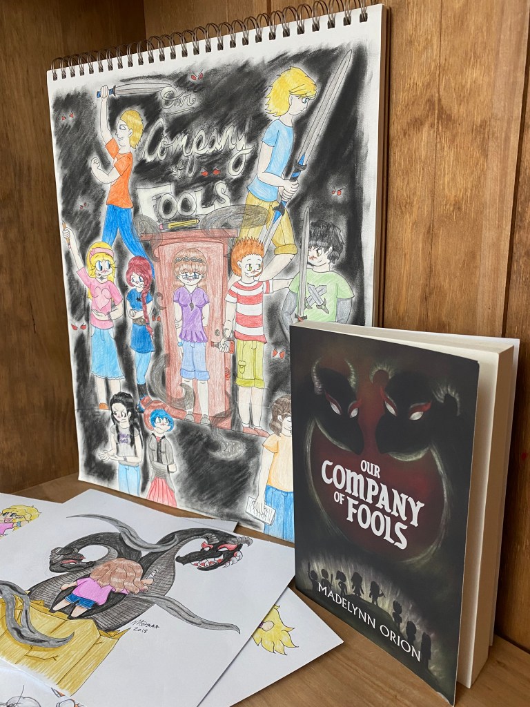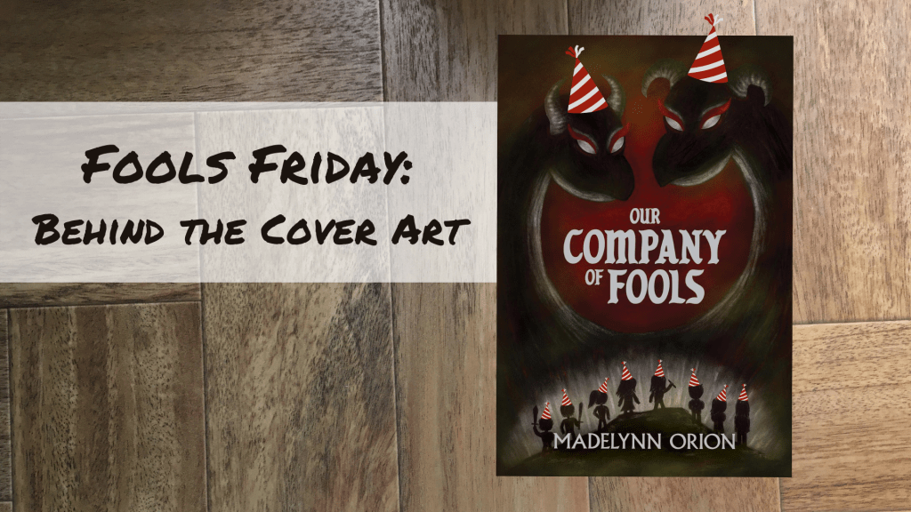
Happy Fools Friday! Today, I wanted to tell the brief history behind the cover art for the book.
The cover was created by Caleb Cole, a graphic designer, fine artist, and friend of mine, but before the project was handed off to him, I actually tried to design a cover myself…using Canva. I know, I know – not the best choice. But I had been using the program for graphic designs for work and thought maybe, just maybe, I could use it for my book cover. I quickly realized I was wrong and abandoned my attempts – the frontrunner looking like this:
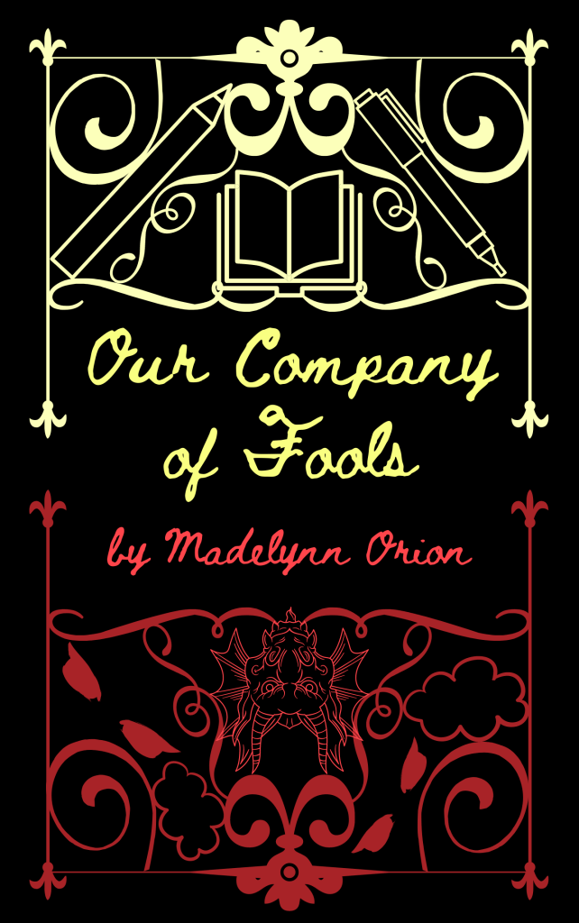
I liked the heart behind this one. It was an attempt to weave together symbols illustrating key pieces of the plot, and a version actually created by a no kidding graphic designer might look really cool as an embossed hardcover. But this…definitely doesn’t make the cut.
After my terrible Canva attempts, I sat down and started to sketch, inspired by a more illustrated approach to the cover. I do draw, but my primary style is Japanese-Chibi-inspired, and I only use pen and paper (not digital art). Still, I thought I’d give it a try, inspired by a new vision for the cover. This is what I ended up with:
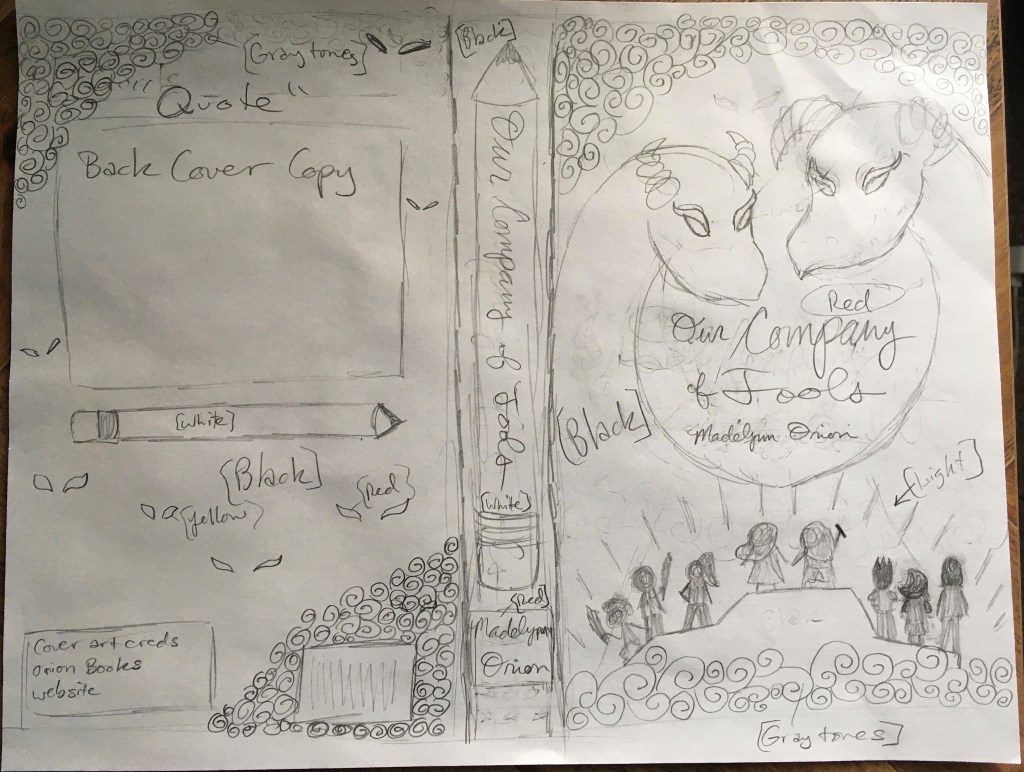
I loved this idea, but I had no clue how I could ever make it look professional on my own. Granted, it took a very misguided attempt to trace over my sketch in Microsoft Paint to realize I would need help bringing this vision to life (yeah, not one of my finest ideas…). Thank goodness I came to my senses and approached Caleb instead! He used my sketch as the basis for his art and nailed it on the first draft. I only asked him to make a few minor formatting tweaks, and the cover was good to go.
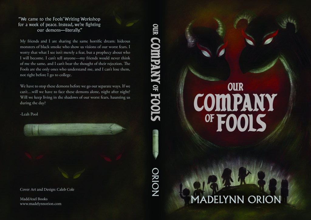
I love that all the big characters are on the cover. We’ve got the statement piece: the two-headed Dragon demon who serves as the book’s big villain. This head is the Whine, and this head is the Bass. And we’ve got the line of heroes at the bottom (from left to right): Percy and Cal with the swords, A.J. with hair in a ponytail, Hallie and Leah side-by-side (and Leah wielding her giant pencil), Roderick with his trademark spiky hair, Faith hugging herself, and Bryce to round out the group. I also appreciate that the white pencil is prominent on spine and back of the book, and how it looks like it’s glowing.
It makes me a little giddy to see this image, and I think it does its job well, showing what the book is about and setting the tone of the story. It was very cool to see it in person and hold the book in my hands for the first time. In fact, I have a special video that captures the moment I first saw the book for the first time—and I’ll share it in a couple of weeks!
Until next week…Huzzah, Fools!
